Using the PURE method to evaluate cognitive load
The PURE method is useful for situations when research investment is unavailable or when numerical data speaks to stakeholders in ways that qualitative data doesn't.
DESIGN METHODS
During my certification in User Experience with a specialty in Design Management with Nielsen Norman Group (NN/g), I was fortunate to meet and learn from Christian Rohrer. Rohrer developed a scoring method to assess cognitive load that could be conducted by experts in UX to provide stakeholders with quantitative comparisons to help with prioritizing problem areas.
The PURE method, which stands for Practical Usability Ratings by Experts, is not a substitute for user research or usability studies. It's useful for situations when research investment is unavailable or when numerical data speaks to stakeholders in ways that qualitative data doesn't.
As a UX designer at G2.com, I brought this method to the team and facilitated a session to surface some UX concerns for one of our key user flows. This led to multiple teams addressing various aspects of the experience iteratively over a six month time frame to significantly improve user satisfaction.
In this post, I'll share the method and some of the findings from the initial exercise as an example.
The PURE method explained
I used the following deck to walk through the process with stakeholders and researchers/designers and as reference throughout the exercise.
Overview
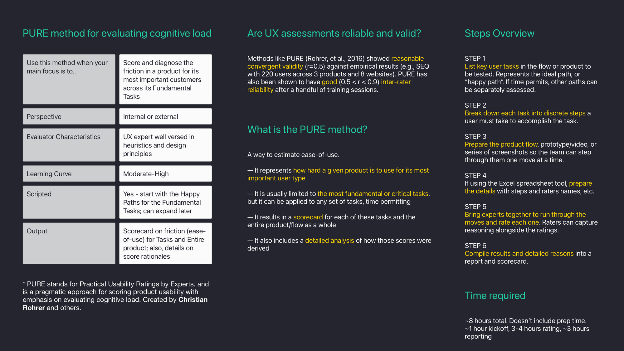
Preparation
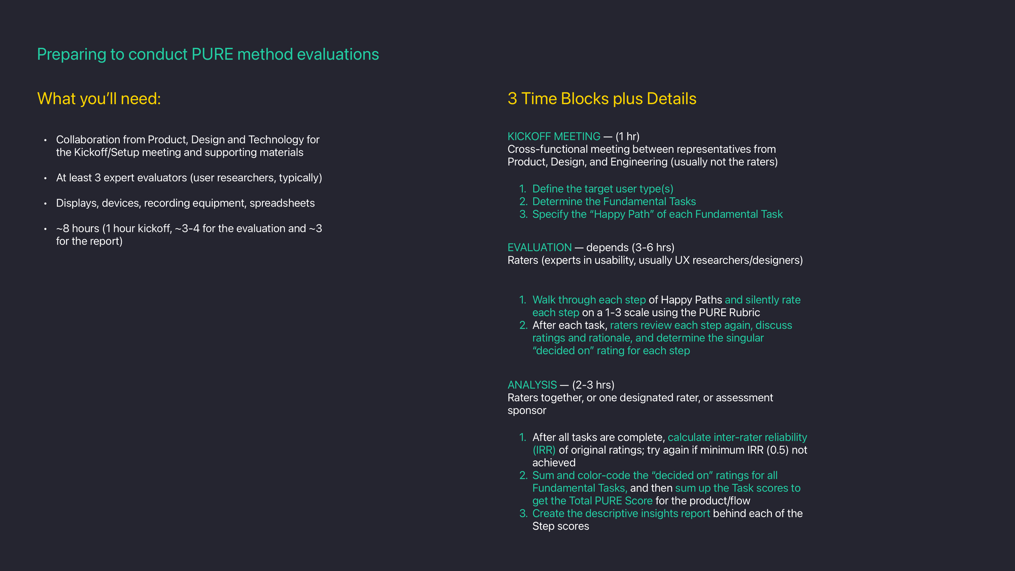
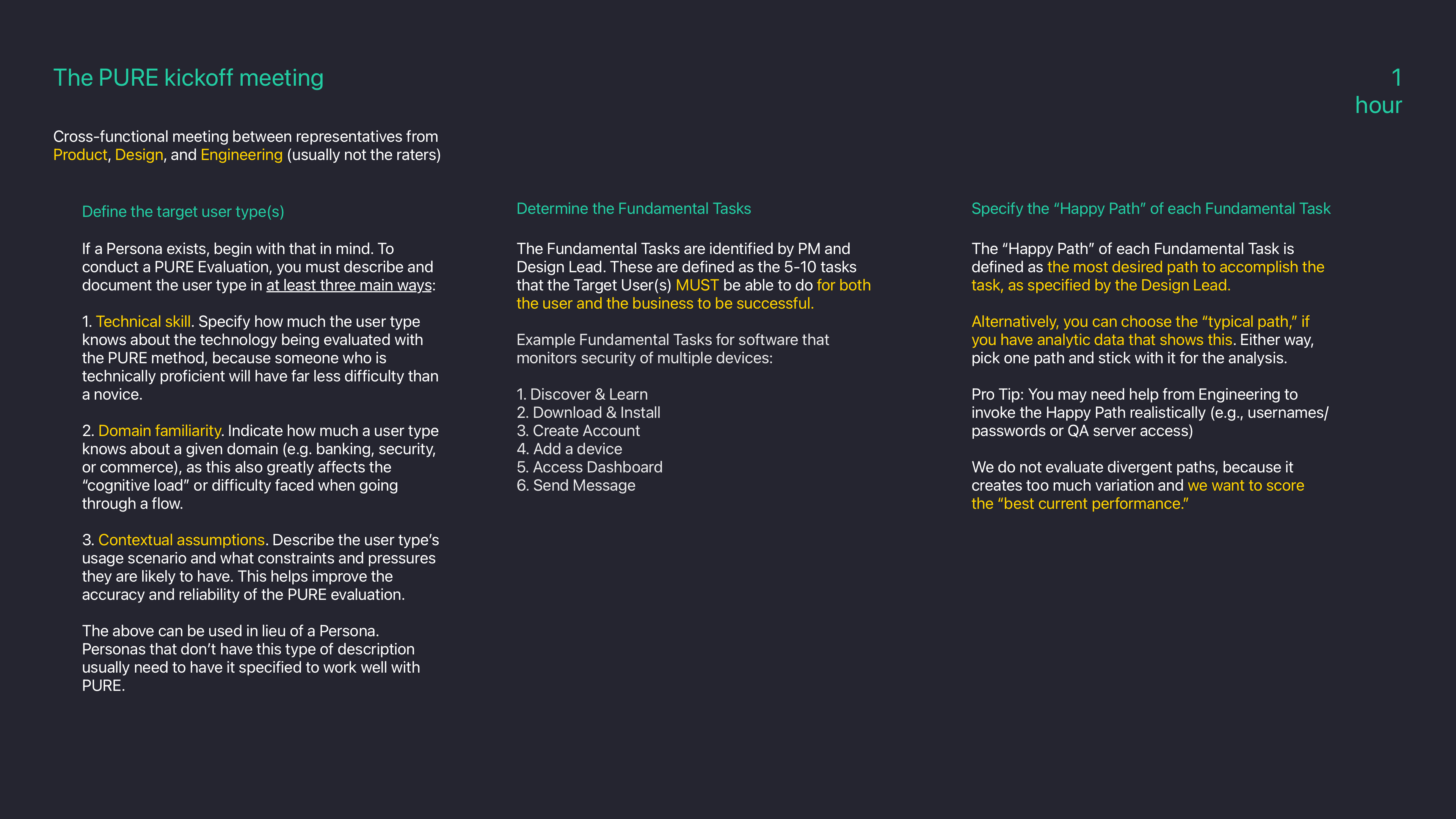
Kickoff meeting
Evaluation walk-through
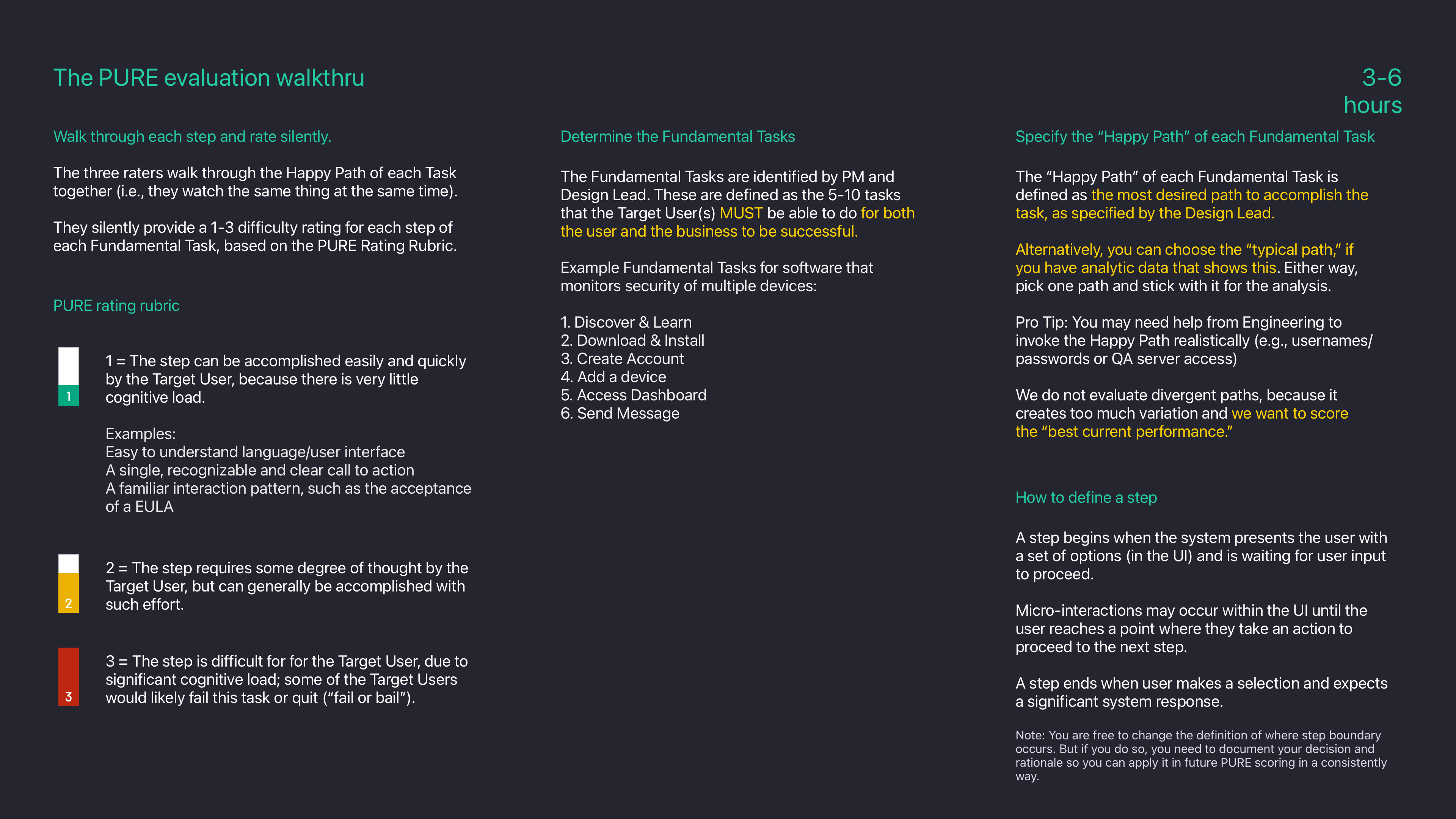
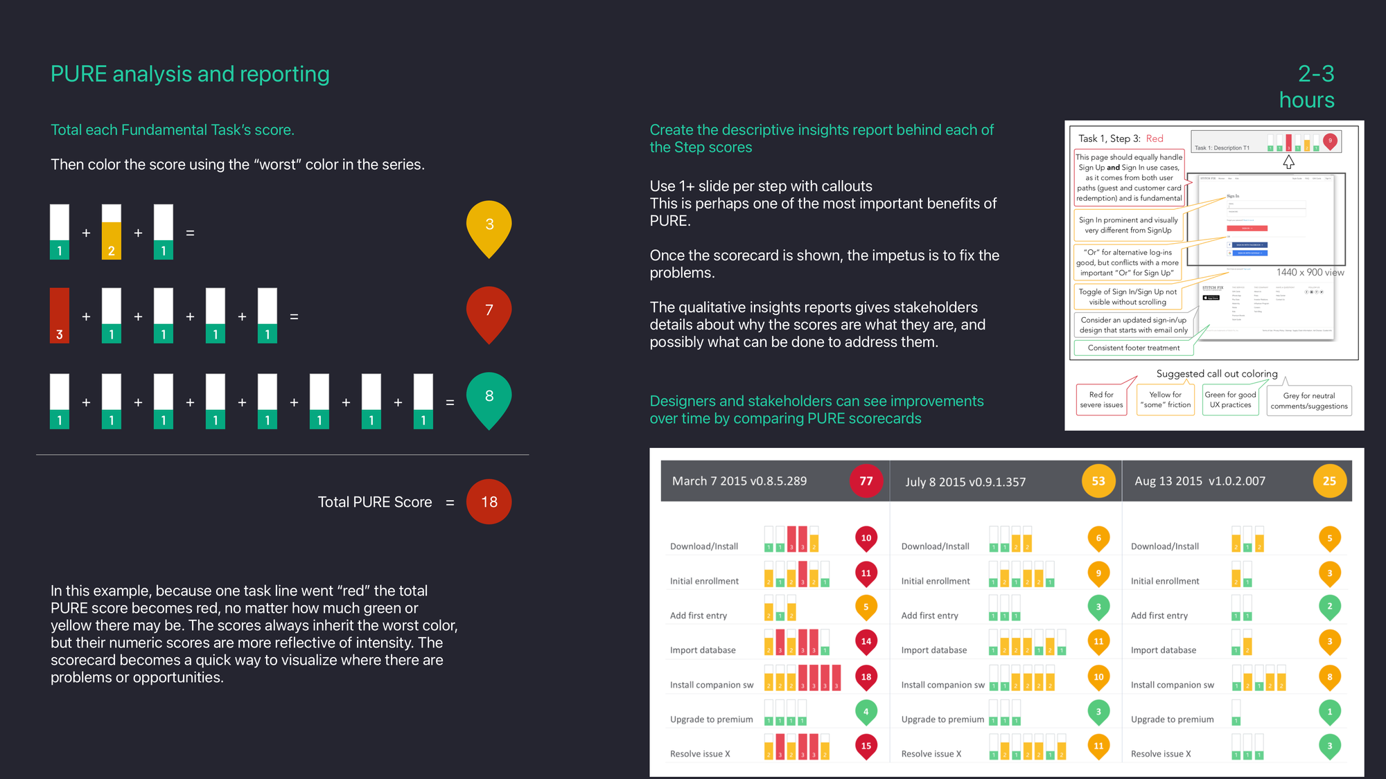
PURE analysis and reporting
Lead responsibilities

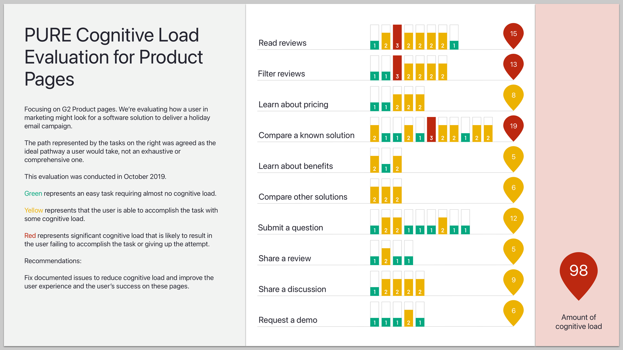
An example from early G2 days
Each software or service product on G2.com has a "home" that hosts all the publicly facing reviews collected through G2 surveys. When a person visits G2.com with the intent of researching different solutions, they need to interact with data and reviews.
The user experience has come a long way since this evaluation in 2019 so I'll just share aspects of it by way of example.
Assessing the product page
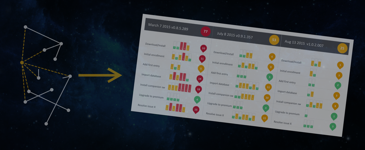
The "scorecard" shows that there are three areas that needed immediate attention. The majority of other areas also could use improvement, although those actions could be used effectively. They just weren't easy to use or contained some unexpected results.
To fill out the "scorecard" we first used a spreadsheet that listed each task and step with cells for ratings and comments. This allowed us to evaluate the inter-rater reliability (IRR) easily in case we began to see concerns or patterns with some raters evaluating differently than others.
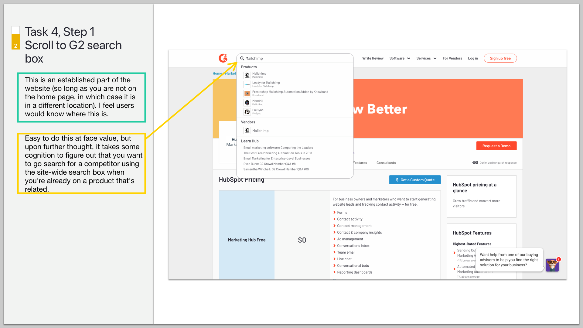
From the spreadsheet I then assembled a deck with slides showing a screenshot of the UI being evaluated along with ratings, comments, and arrows pointing to any areas being referenced. This was a powerful way to present our findings and drill in for deeper discussions with stakeholders and teams who could make improvements.
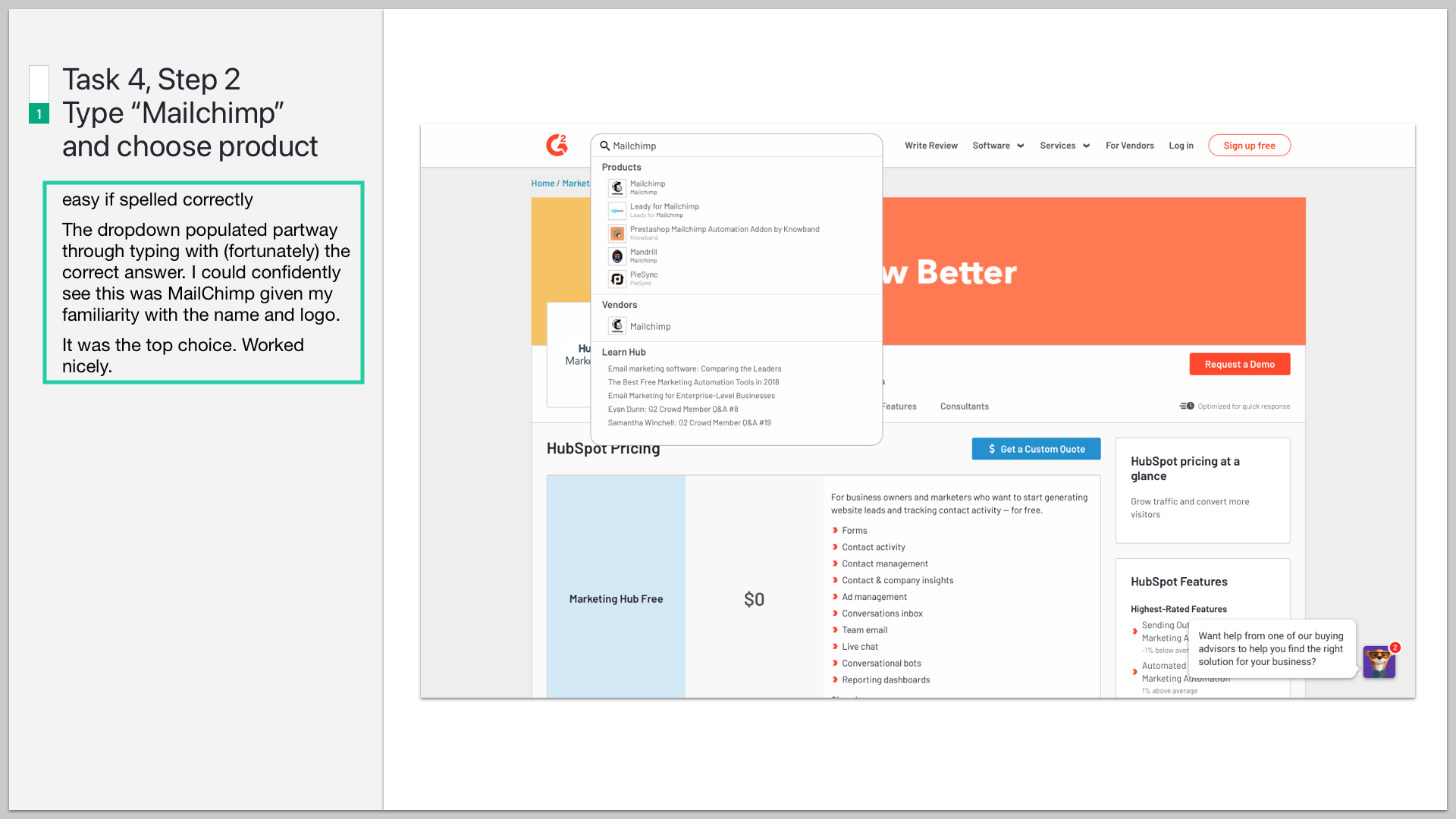
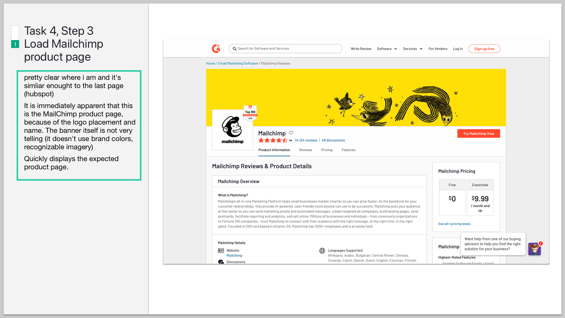
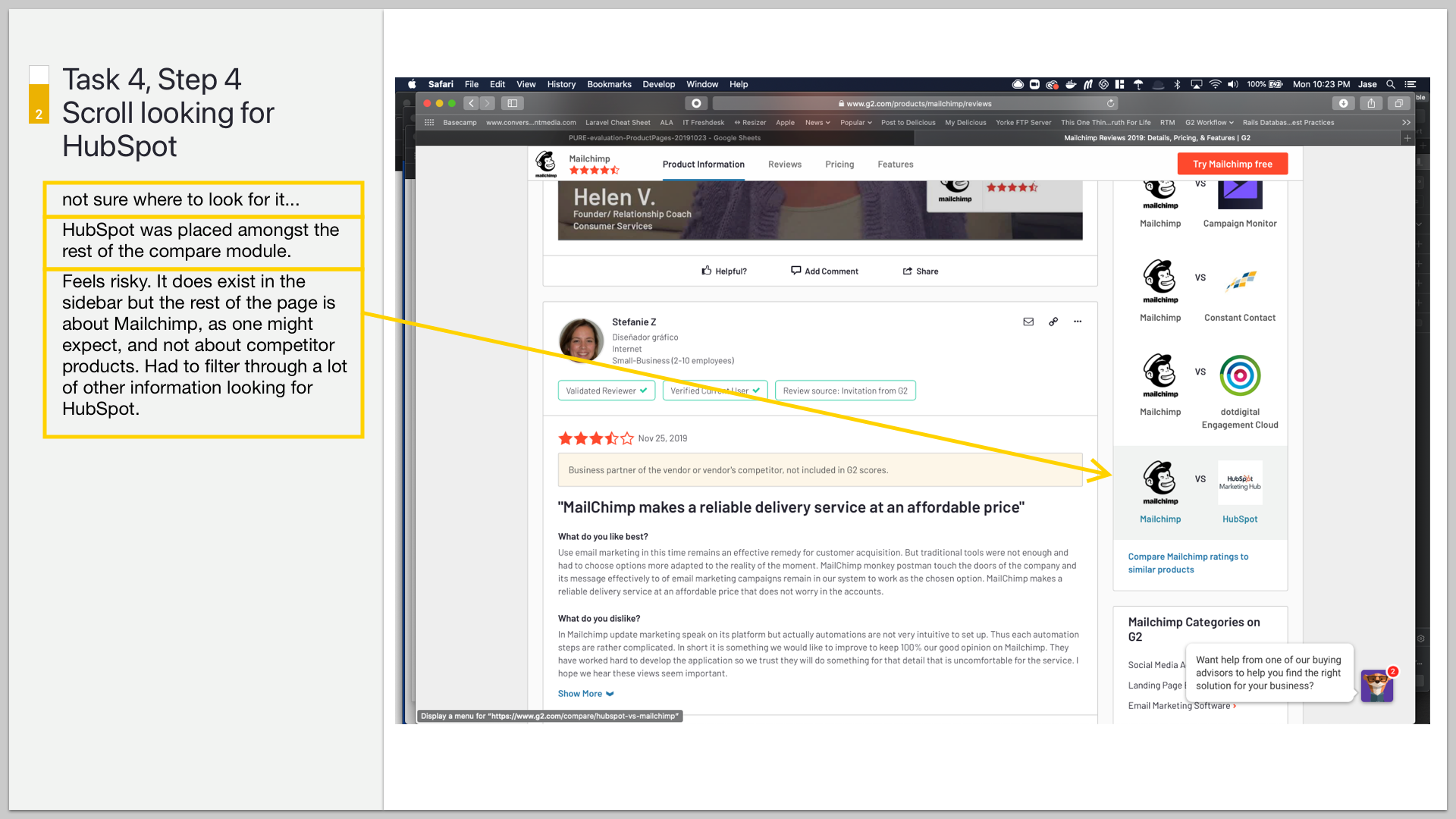
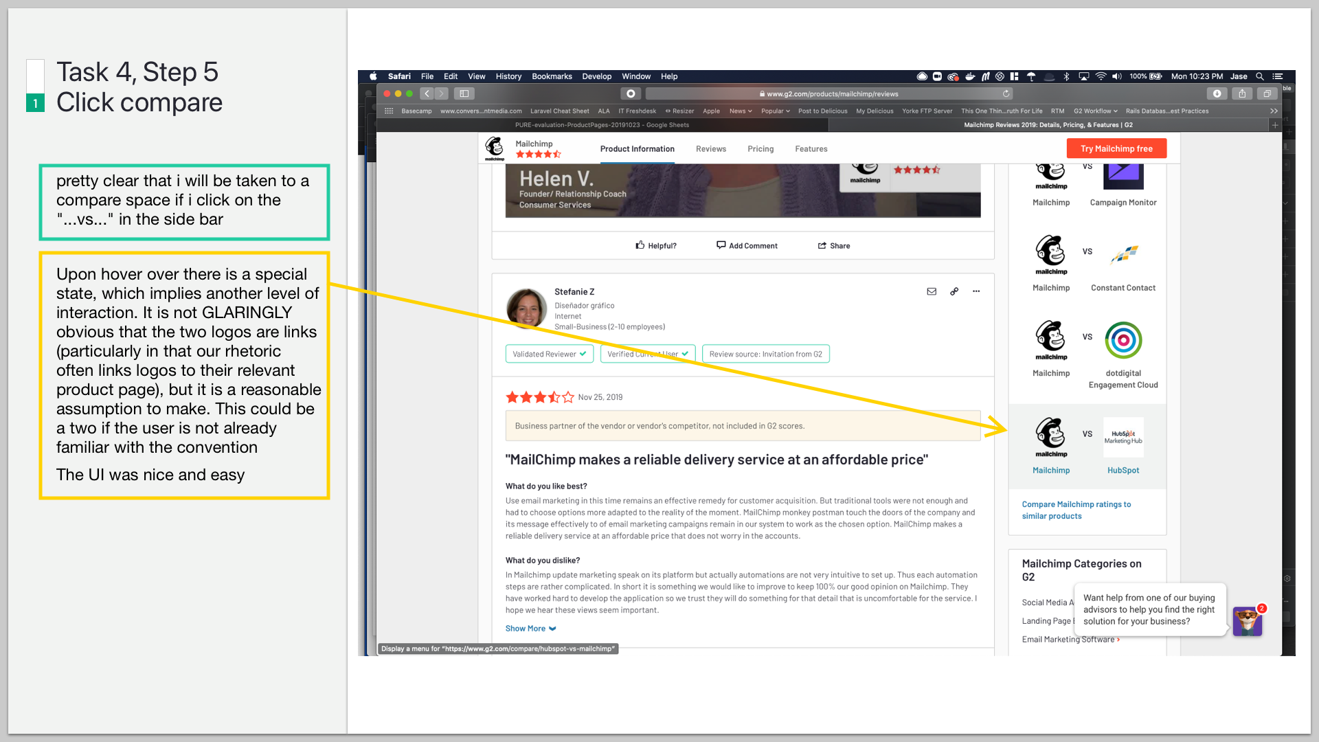
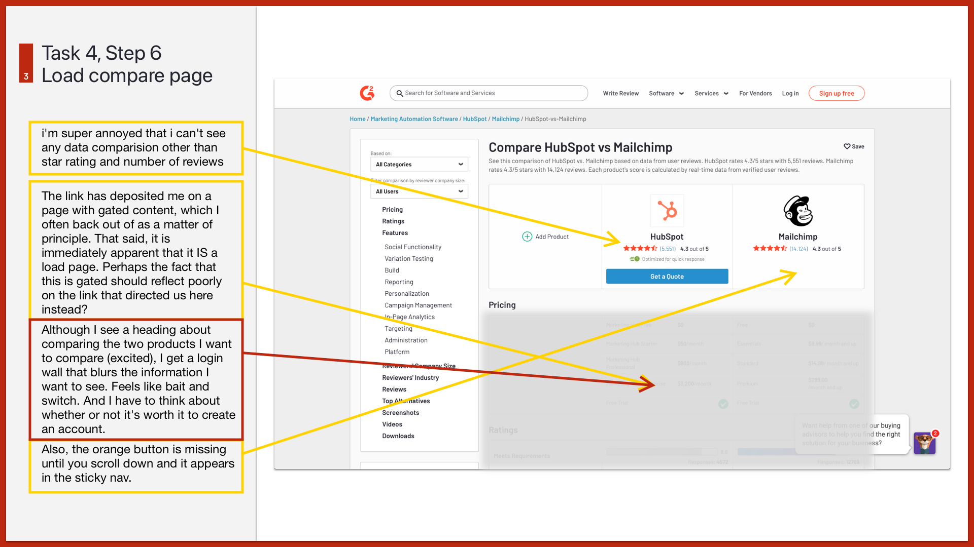
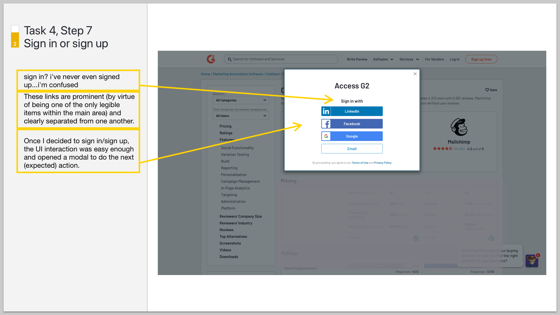
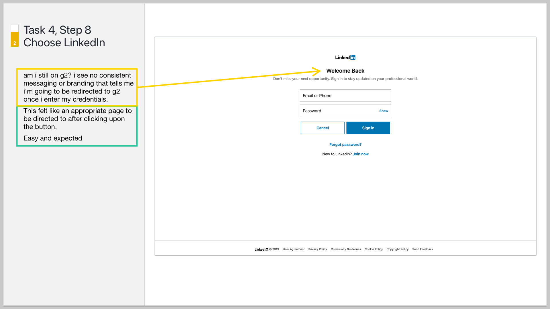
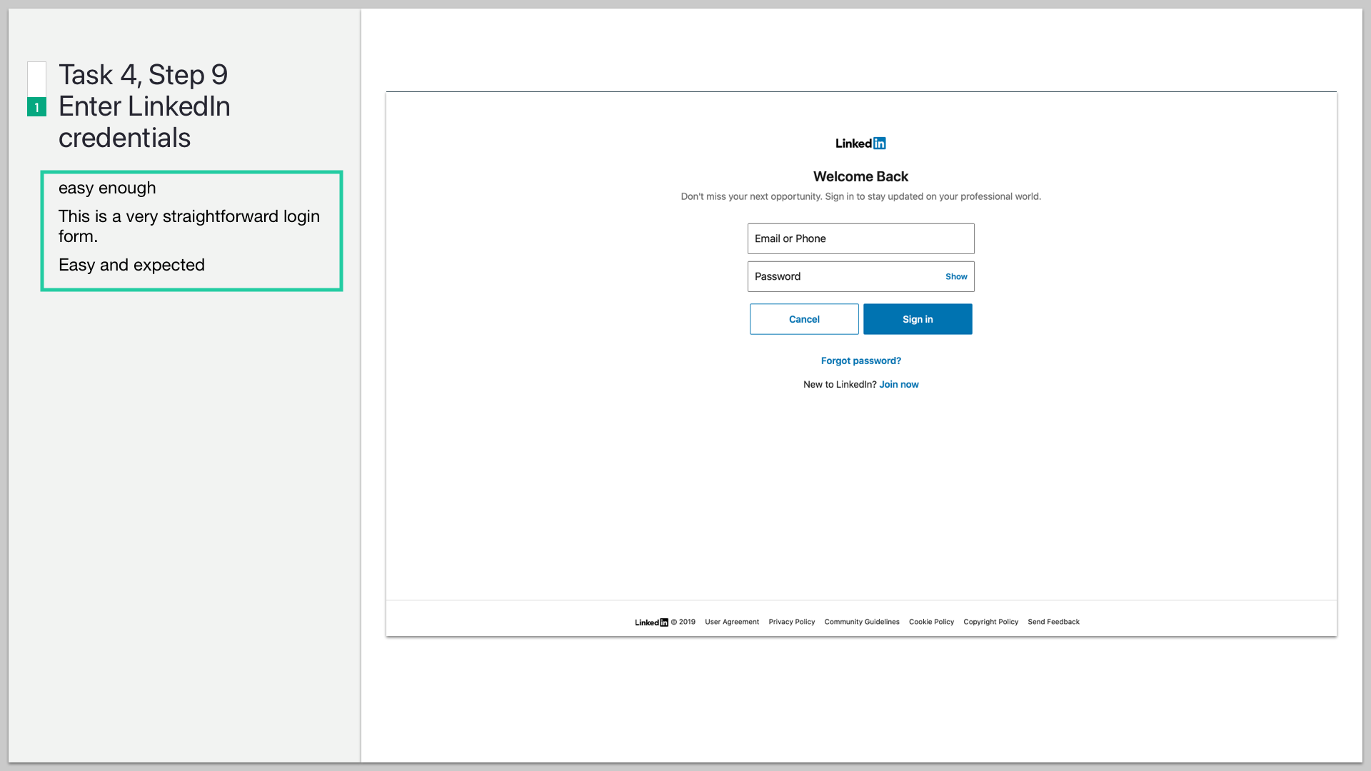
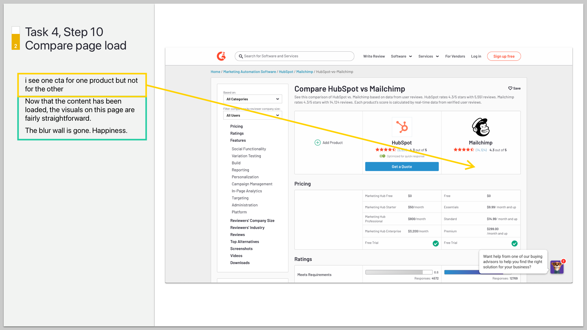
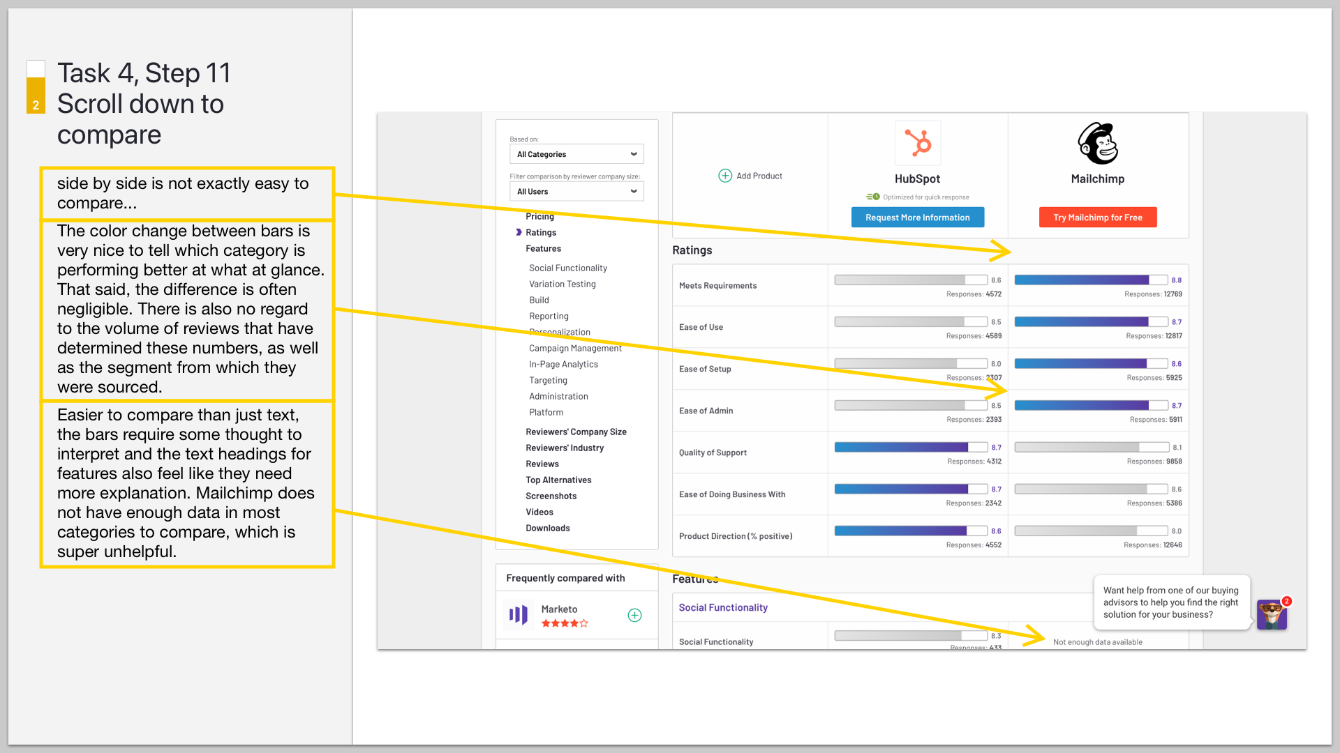
Task 4 — Compare a known solution
Here are the slides for the steps from Task 4 in the above scorecard.
Impact
Stakeholders aligned to prioritize the most concerning issues this raised, and teams deployed fixes and iterations to improve and enhance this key experience in our product.
Subsequent evaluations demonstrate the improvement of these tasks and steps. Sometimes a task gets improved by eliminating a step. This is not a formula for how to address issues in a product but a tool to bring clarity to prioritization decisions and a comparative tool for demonstrating the evolving story of a product.