Moving beyond desktop: Designing device-agnostic user generated content
As lead designer on our user generated content team, I discovered opportunities to improve our core product from user feedback, data analysis, and user interviews.
CASE STUDY
Role: Lead Designer
Highlights
- As lead designer on our user generated content team, I discovered opportunities to improve our core product from user feedback, data analysis, and user interviews.
- The original review collection form only worked well on desktop devices, which did not align with data we collected about how our outreach strategy actually worked in the lives of our users.
- I prototyped several potential solutions and collaborated with stakeholders and engineers to make significant improvements in review completion, user satisfaction, and data quality—all of which contributed to increased trust, deeper insights, more value, and sales revenue.
- Although the redesign was a major initiative, it afforded a series of iterative enhancements as well as future innovations.
Contents
Setting the stage
Every experience is a story. Sometimes we’re quiet about our stories, and sometimes it seems no one is listening. Dynamics like this—which keep stories from being told or from being heard—rob the world of vital insights, and keep people from making connections that matter.
At G2.com we learned that the experiences people had with software were a story that needed to be told. G2 established its review form to collect aspects of those stories and to assemble them into a fuller, clearer picture of what to expect when using specific software. We found that user complaints sent directly to software makers were often ignored and users felt powerless. Sharing their software stories in public empowered them by validating their experiences, comparing them with others, and feeling “heard”. As G2’s influence in the market soared, software companies began to listen to their users through their reviews. The connection between software makers and their users began to change the leverage users had to see real and positive change.
At G2.com I was lead designer on a consumer-facing user generated content team. Our primary objective was to continuously improve review collection. Over time, this objective led us to many valuable evolutions of various aspects of review collection.
The value of G2’s data and insights are directly determined by the amount and quality of reviews. This public data and its correlated insights are valuable enough to create a marketplace where software companies are willing to pay for profiles and competitive insights they can highlight. Investing in a profile helps companies focus on improving what their users love about them—and they find those opportunities in the reviews their users write.
It’s a dual-sided marketplace that operates like a flywheel where one success amplifies others. Eventually, this data began to power investor insights as well. Software companies are naturally incentivized to learn from user review data in order to improve their software and showcase their strengths, creating the possibility of a virtuous cycle. Software users now have a voice and software companies are listening.
That dynamic requires high quality, trusted review data in significant quantities.
A quick orientation
I use a scalable iterative process when addressing any challenge. It can be lightweight and undocumented or robust and highly documented. It maintains a fairly consistent shape whether guiding a quick decision or a long term project.
In brief, we need to:
- Understand what we can about problems/challenges (discover)
- Form strategies and “bets”/hypotheses leading to possible solutions (assess)
- Decide a course of action (prioritize)
- Design, build, test (act)
When done well, there are iterations and learnings in each of these steps and at the end of a cycle. It’s a method for continuous improvement. I’ll use these steps as anchor points in this case study.
Discovering opportunities

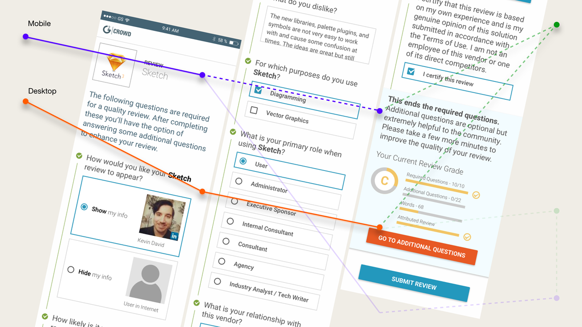
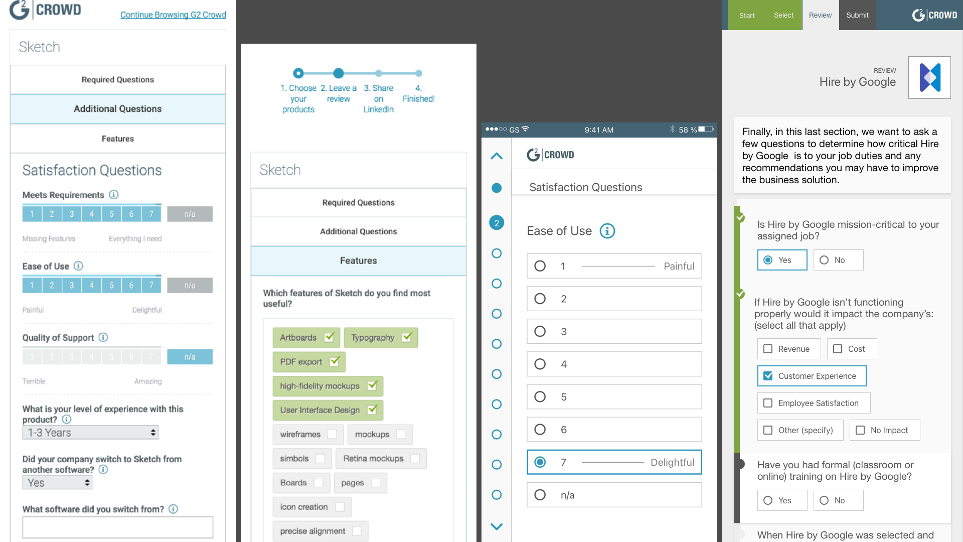
Through a regular practice of data analysis, user feedback, and usability interviews, I discovered a significant opportunity for improvement. Our original review form suffered from an inaccurate assumption that a significant majority of our users interacted with email and the web using a desktop computer at a desk in an office environment.
Interaction data indicated that the abandonment rate from mobile devices was 98%. It was an overlooked metric because of the “desktop assumption”. Our outreach team used email to reach consumers who could review software.
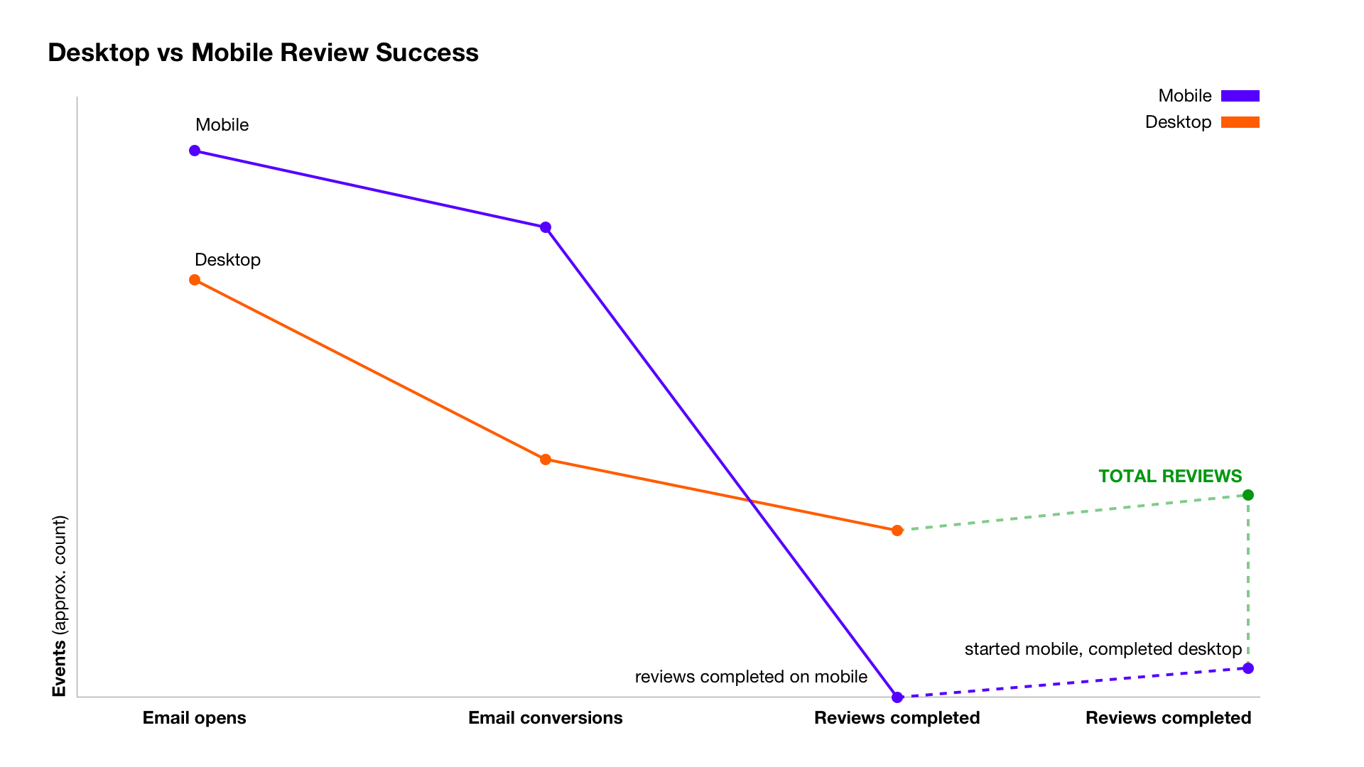
Digging into device interaction data, these users read email on mobile devices more than 65% of the time, even at work. A sizable amount of that interaction data was also correlated with typical office commute times based on geographical time zones. We appeared to be reaching large numbers of potential reviewers at times when they were nowhere near a desktop.
Since our review form was only designed for desktop computers, it was mostly unusable on mobile devices. Prospective reviewers would read their email on a mobile device and then have to intentionally re-open it on a desktop device in order to complete the review—often after they had presumably returned to work on a subsequent day.
The friction and frustration around this led to the loss of potentially valuable reviews and reduced quality. Many users who completed a review did only the minimum questions so they could move on with their day. Quantitative data showed this to be the case, but user interviews provided qualitative insights about why this was the case. Understanding the data more holistically, we had a significant opportunity to use the data to drive product and design priorities.
After visualizing the data we had, I helped stakeholders visualize the potential increases that could be possible with a fully functional mobile review form in place. Although these factors are complex, the visualization helped everyone align on why we should be taking the opportunity seriously.
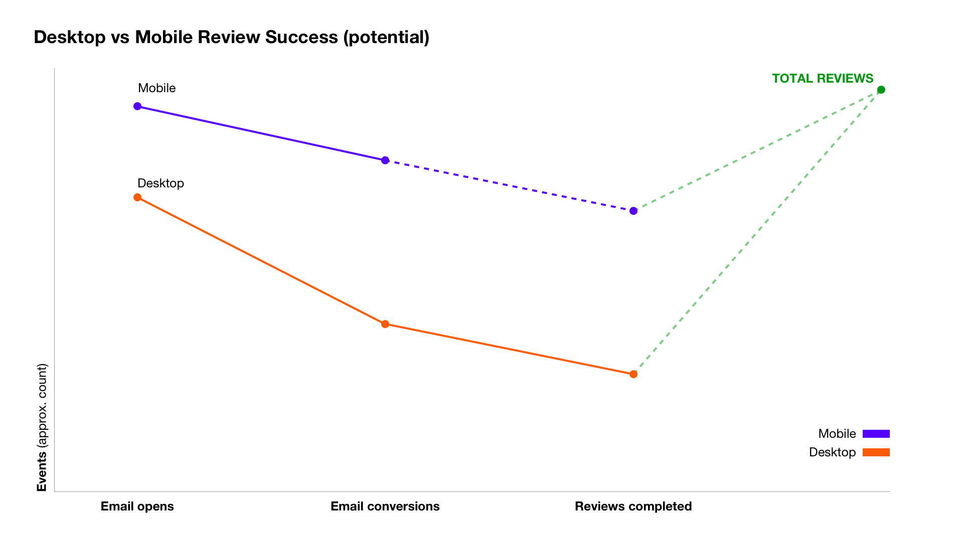
Mobile usability was our primary focus, but industry trends suggested taking a more device agnostic approach could solve for mobile as well as other devices in the future. I took on the challenge to go beyond “mobile” design to consider industry trends with many surface styles and sizes.
Additional highlights from research
Seeking to understand the context and dynamics in which would-be reviewers engaged with our emails and website formed a backlog of additional improvements for future consideration. We discussed which of these might efficiently dovetail with a form redesign and which should wait for future iterations.
- Navigation — the original form was built using a tabbed structure and some questions depended on user’s answers to determine relevancy. This combination meant the tabbed structures became difficult to navigate depending on answers; new tabs would appear during the process which were sometimes overlooked or confused users.
- Input field interaction design — Input fields didn’t have a way to indicate errors and were presented in a style that suggested an outdated interface design. Accessibility guidelines were only loosely followed and the tabbed structure complicated usability.
- Error visibility and correction — errors were summarized in vague statements like, “Correct errors before proceeding.” We could design for a lot more clarity and put those errors in context to help users correct them quickly and clearly.
- System visibility and fault tolerance — there was no indication to the user of whether a connection was persistently established. Since filling out a long form could lose data if the Internet connection failed, we could build fault-tolerant data handling methods into the experience. This would especially be valuable for reviewers using mobile devices during a commute or where Internet connections might fail intermittently.
- Quality scoring — A letter grade system was used to score review quality and to encourage users to provide more information for a higher grade. The assumption was that reviewers understood how such a grading system works. In a global marketplace this is not a strong foundation for communicating quality or value in a broader context. We could explore better methods.
- Portability and extensibility — the review form had become its own complicated product and data points and inputs were difficult to abstract from it. Question relationships were fragile. Variations of the review form, for instance, or APIs to collect question data from other sources were all too complicated to attempt using the existing solution.
- Cognitive load and time to completion — The form consisted of 30 questions in its simplest form and could expand to over 100 depending on certain answers given by the respondent. This meant the form could feel like it was never-ending, did not provide good visibility about the user’s status or progress, and felt sometimes like a heavy burden for users. The more they answered the more questions appeared. Time to completion was far more than the 10 minutes advertised for most users. I used the PURE method to assess cognitive load on usability and the scoring results provided leadership and other stakeholders with quantifiable evidence of aspects in need of the most attention.
Opportunity-solution trees

Mapping our discovery insights in opportunity-solution trees allowed us to visualize paths toward desired outcomes.
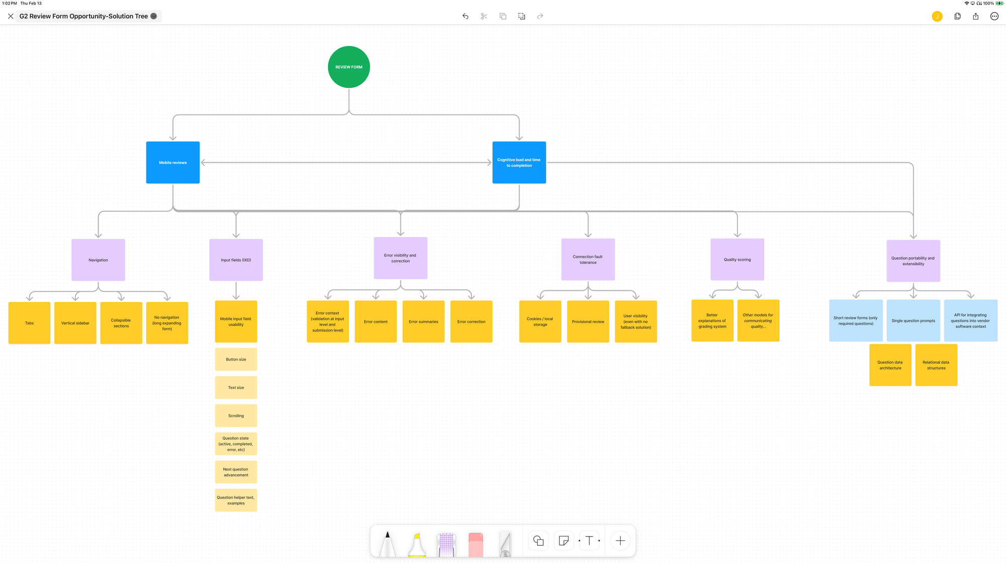
- I proposed combining mobile usability with navigation flow since those would structurally influence each other.
- Input field design could either be included with the first redesign or possibly held for a next iteration.
- Portability and extensibility could be bundled into a future enhancement or two.
- Cognitive load and time to completion could be impacted by any of the above improvements, but could also benefit from focused approaches we could enhance iteratively.
The primary hurdle, and the first problem we sought to address was:
How might we design a new review form for mobile and desktop in a way that allows related questions to load as part of the natural flow based on user answers?
Framing the problem as a “how might we” question encourages expanded possibilities and innovative thinking.
Assessing strategy
Collaborating with teams and stakeholders in a design sprint format, we aligned our understanding and debated various approaches. It was important to consider the problem and solution holistically since it involved data models and structures as much as UX and interactive UI. It required a full team exploration, and we invited stakeholders from product, design, engineering, outreach, marketing, and leadership to participate at key points.
The design sprint format combined strategic exploration with rapid prototyping within a week.
Through this process we acknowledged we could ship fastest by creating a “mobile only” version, having separate forms for each device type that would populate the same data. This would also reduce the risks of altering our existing desktop review form. However, there were complications to this approach.
Question data architecture would still need to be considered carefully and changes would like be needed to support another data input vector. With new device surfaces and sizes appearing rapidly on the market (e.g. tablets and cross-over devices) and an anticipation that more would arise (e.g. VR headsets), we also considered the design and engineering costs of maintaining multiple UGC vectors over time. We explored the risks of needing to disambiguate device types to serve the correct form. We also wanted to keep accessibility standards in mind across all experiences.
Prioritizing solutions

Based on the insights we gathered from multiple perspectives, we decided to keep a single, unified form experience, and redesign it to perform in a device-agnostic way. To build confidence we clarified outcomes and scope.
The product outcomes we prioritized were:
- Ability to successfully complete a full review on any reasonable device (i.e. no smart-watches)
- Increase conversion and reduce abandonment once reviews were started (across all device types)
- Increase quality scores of non-desktop review data without adversely affecting quality of desktop reviews
Since this was our company’s core product a redesign would activate certain risks to the desktop experience, and we would need to appropriately manage those risks. Most of the identified risks were technical ones.
We needed to:
- …ensure the new form would interact properly with existing question data, and that data integrity would remain intact
- …make sure that introducing a new React framework (an approach favored by our engineers) would not disrupt or corrupt our data
- …provide assurances that our integrations used by Outreach and our data scientists working with machine learning and AI would continue to work
- …have plans in place for a quick and seamless switchover with fallback procedures in case we needed to rollback our solution after launch
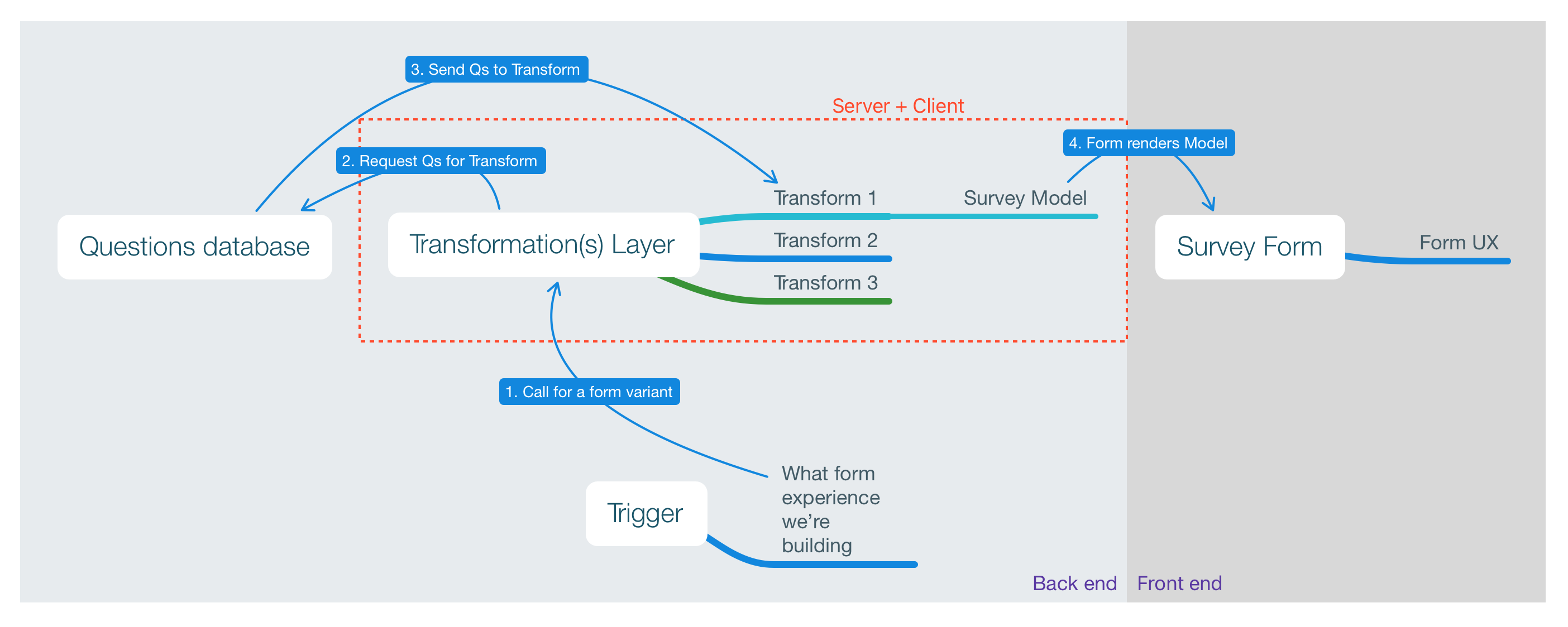
Since understanding the system architecture was critical for understanding what was feasible in design, I worked closely with engineering to abstract a high level model we could use to communicate for clarity in our team and in conversations with stakeholders.
Act for impact

While I explored design solutions for input fields, navigation structures, and error handling, our engineering team did technical research on frameworks and systems. Our data science and moderation teams explored alternative concepts to quality scoring.
We held daily standups and weekly demos where we shared ideas, blockers, and learnings. We collaborated to keep each other unblocked and aligning toward our shared outcomes.
Throughout the redesign, we did multiple rounds of prototypes and user testing via UserTesting.com, Zoom interviews, Maze surveys, usability tests, and prototypes to de-risk and validate our assumptions. We leveraged Sales calls with long-time customers to hear their thoughts and learn from their concerns. Before launching the new review form, we used A/B testing to confirm interaction data was moving in the right direction, and communicated with customers about the forthcoming changes and reasons for change.
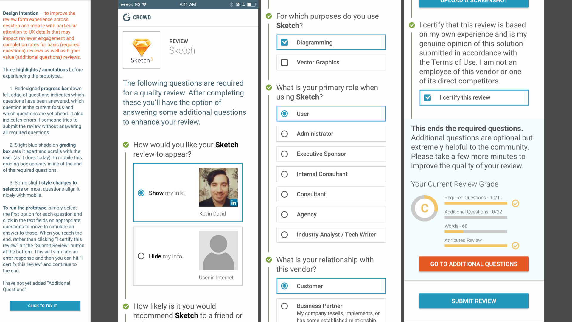
Kickoff concept prototype
The new form was built with React, which afforded our team the opportunity to introduce the rest of the company to Storybook as a way to organize, document, and iterate design system components.
React allowed much better error handling at the question level, so we were able to add improved interactions around that when we launched.
We had tremendous success with the outcomes we set out to achieve.
- Users could now successfully complete a full review on any reasonable device.
- Conversion rates increased by more than 40%. Mobile conversion rates were about 60%. Abandonment rate for mobile fell from 98% to around 20%, which was similar to desktop metrics at the time.
- Quality scores increased across the board.
Impact
The new review form’s initial success was only the beginning. The improved data architecture of the new form allowed us to explore innovations in machine learning and AI to triage suspicious reviews and assist moderators in their work of validating reviews.
The new form’s UI design allowed us to enhance the user experience by providing more interactive help features, better responsiveness, and encouragement during the review process. It also led to improvements for Outreach landing pages, software discovery, and users filling out multiple reviews. It also allowed us to explore form variations, like a short-form to collect key data points in a user’s story, reductions in redundant questions when responses were previously provided by a user, and an API to allow future form designs to be integrated with software—the ultimate in-context review collection. Data quality was greatly enhanced through these efforts, which in turn, made our insight reports, industry trends, and competitive data even more accurate and valuable.